Onboarding screens
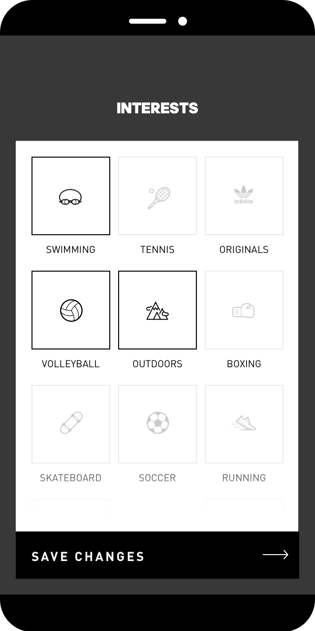
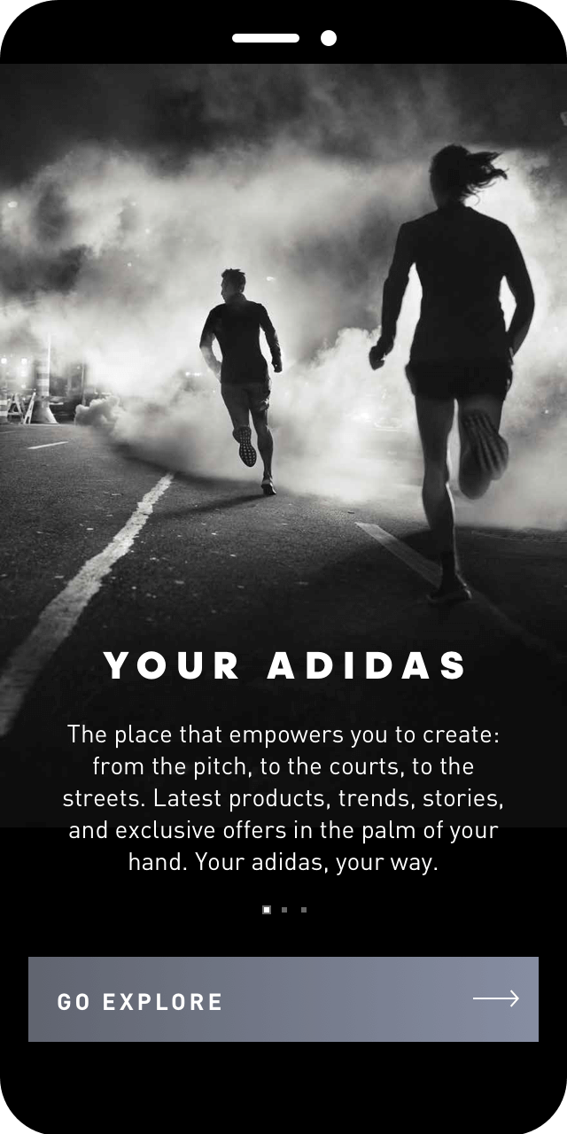
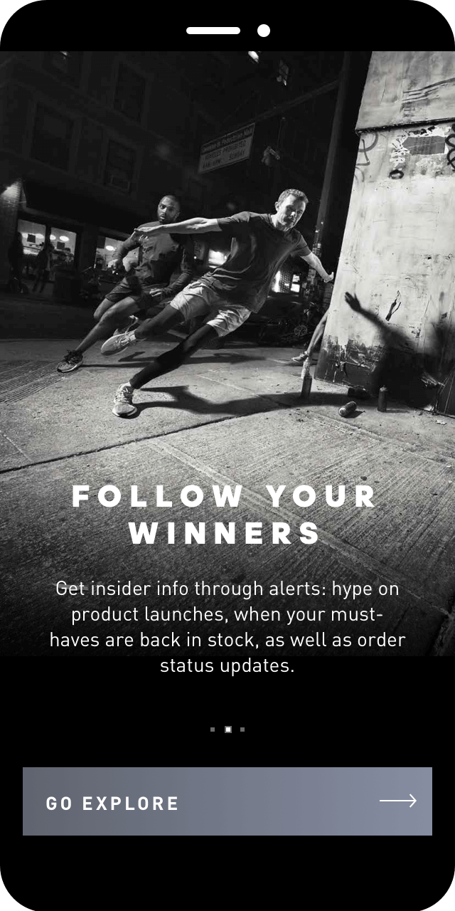
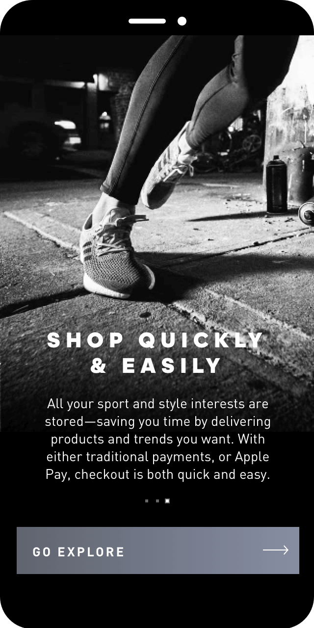
Designed to guide the users through the app experience, these screens give them a little bit of context around the app, revealing its benefits and, at the same time, try to give the app a shot and convert them into invested users.
Feed
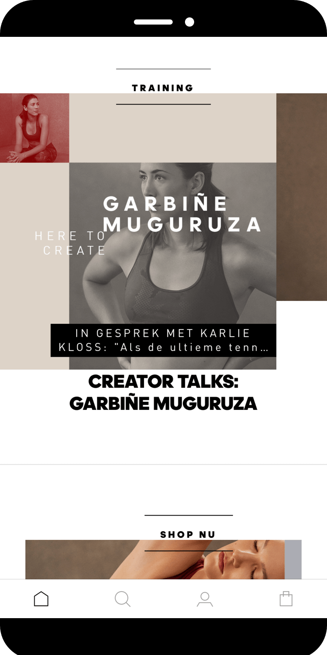
The newsfeed informs you about new product releases and events, prioritising the ones that you’ve already told adidas you’re interested in. It also integrates Confirmed, the previous adidas app designed for new releases, giving you the possibility to be updated with the new product launches and hot drops.
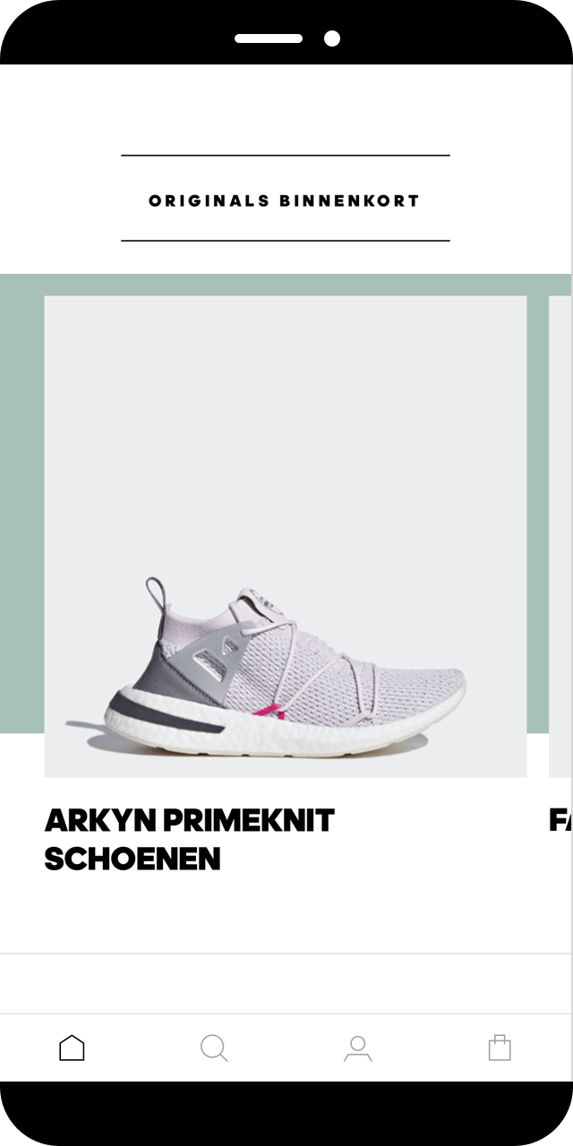
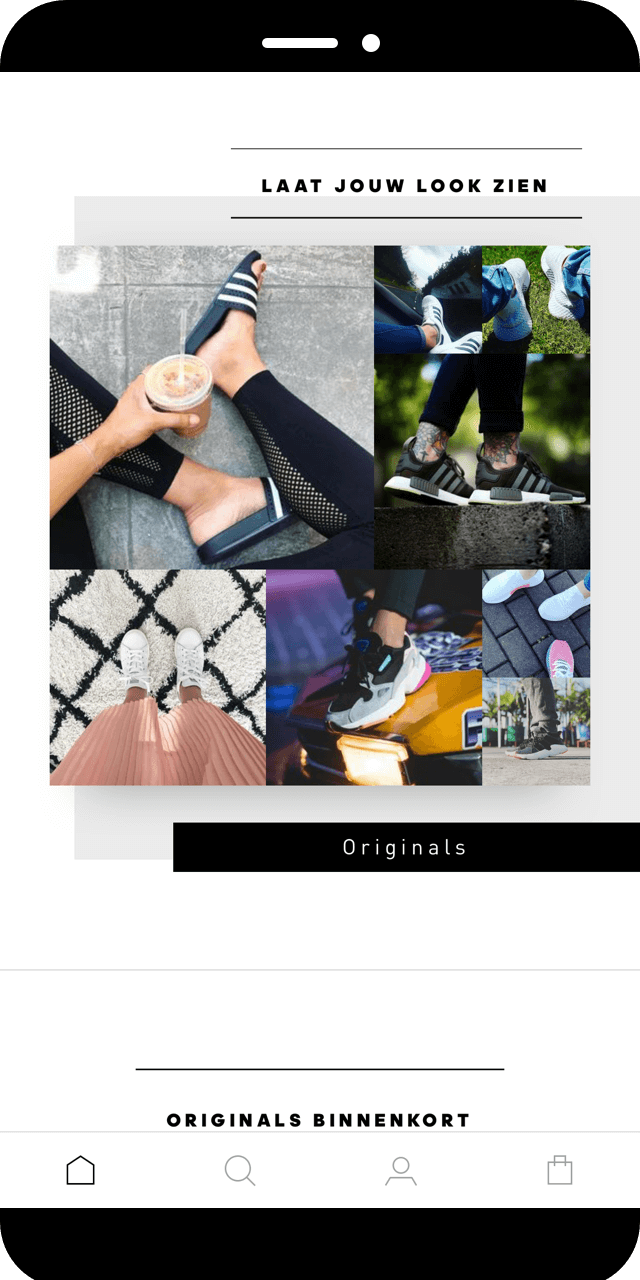
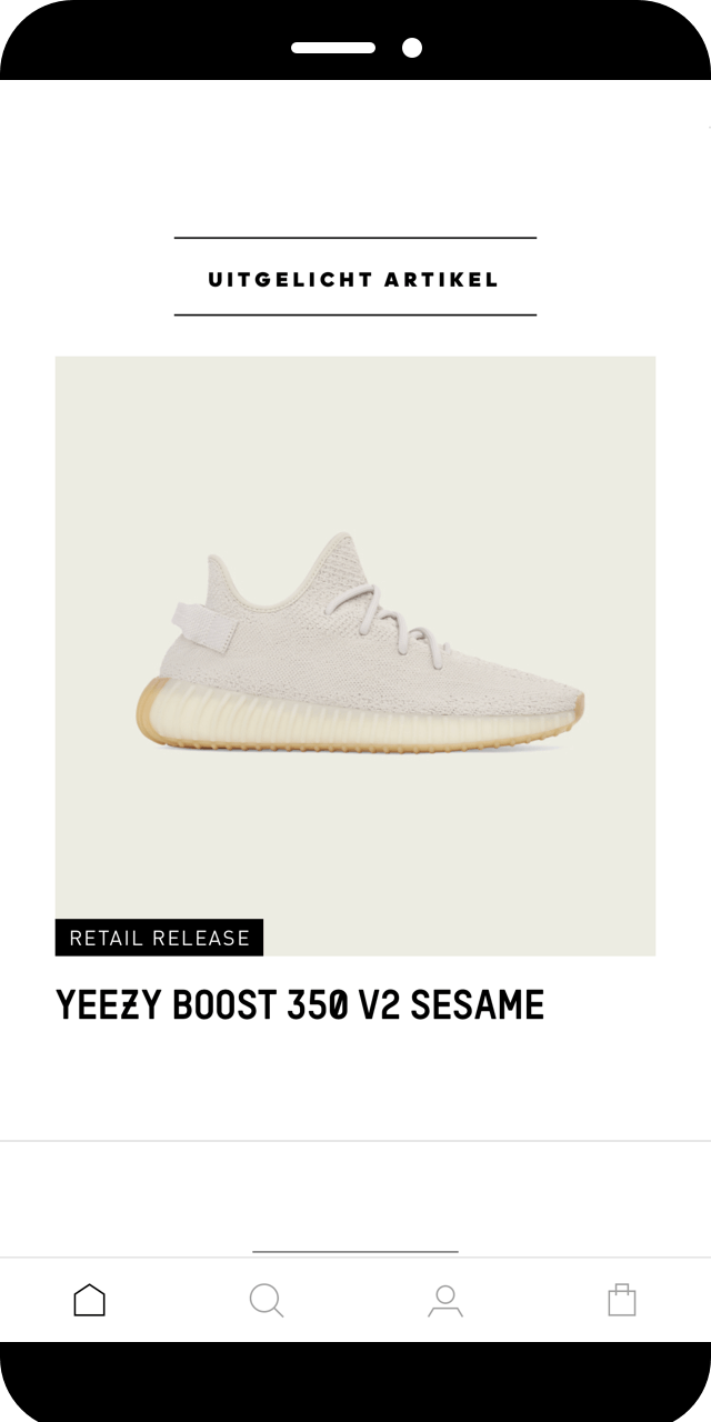
Browse and search
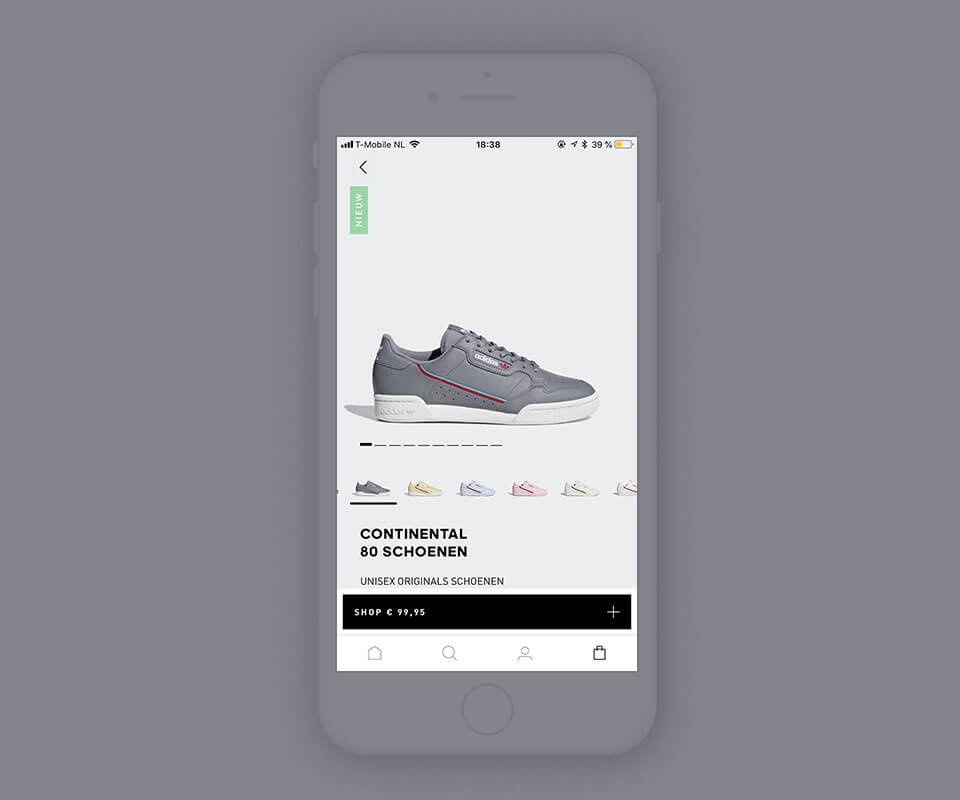
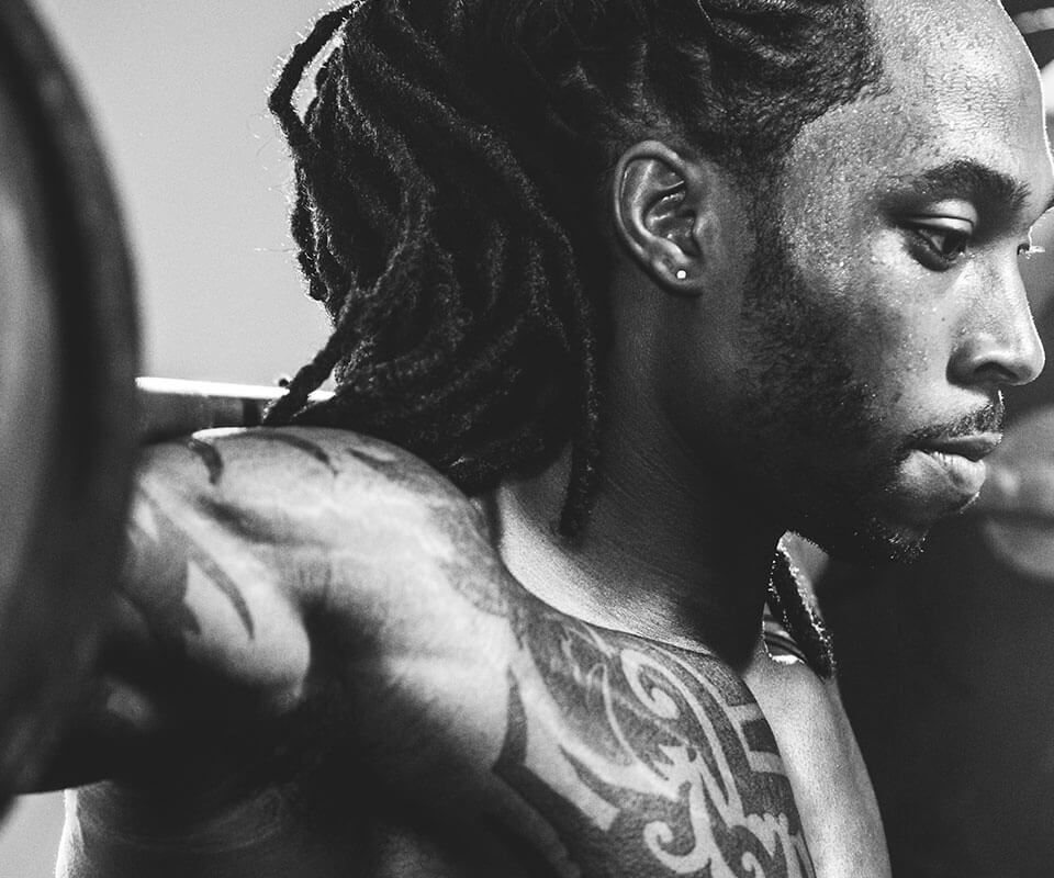
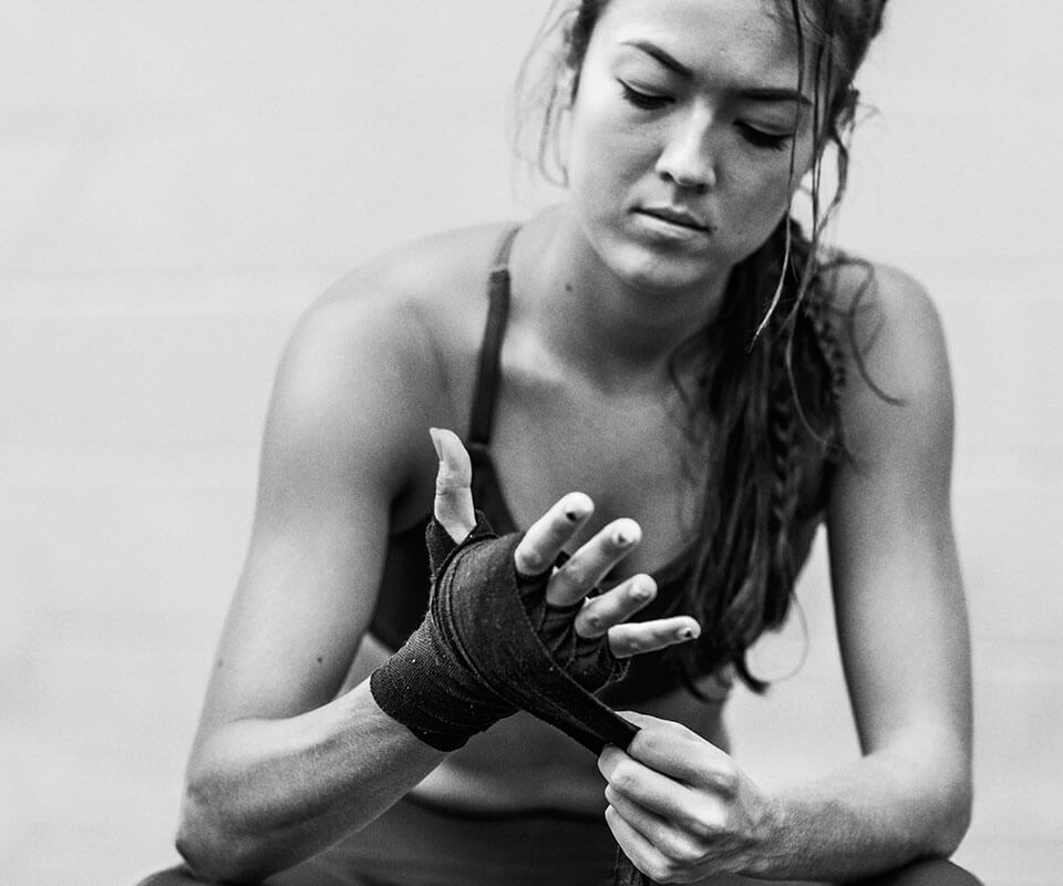
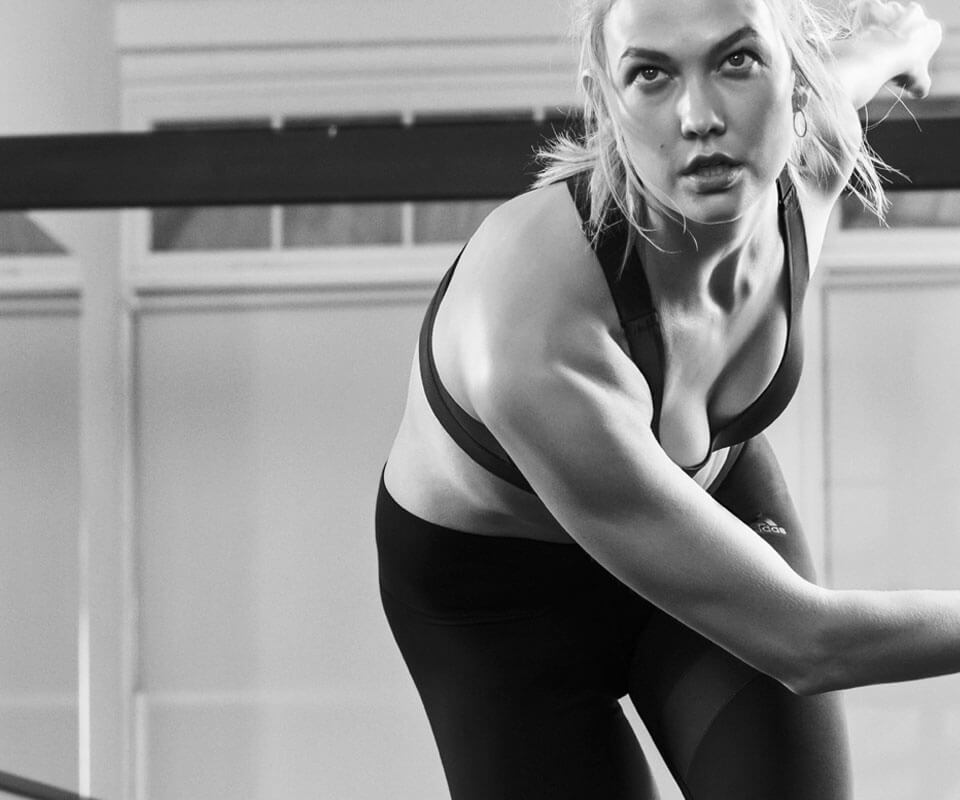
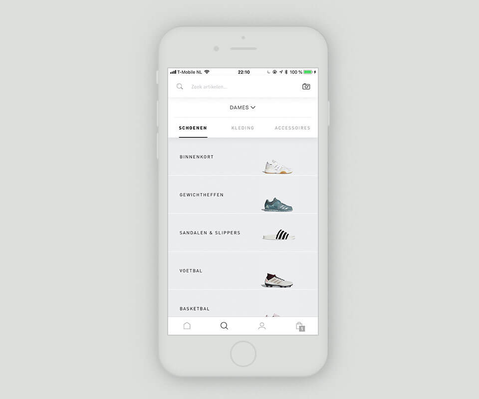
Due to the wide catalogue, the search section is one of the most complex parts of the app. We tried to display the product in a easy way, being consisten at the same time with the .com experience. With a minimal photography style and a neutral color palette, the new adidas app helps the user in the journey of finding that specific product that he is looking for, but also in going thought the whole product catalogue
On a frist level, the search tab is designed to be sticky, providing the user the “always on” opportunity of finding his favourite product by tapping the name of it or using the visual search
On a secondary level, there is a section that divides the catalogue by gender: women, men, or children, offering the user the possibility of switching it at any time of the experience.
On a third level, the product inventory changes depending on the category selected: shoes, clothes or accessories. Whenever the user types in one of them, a product menu will appear offering him the chance of selecting a subcategory based on the type of sport (tennis, running..) or type of item (leggings, socks…) All of these categories have a name and a picture to makes the search simpler and easier
Design system
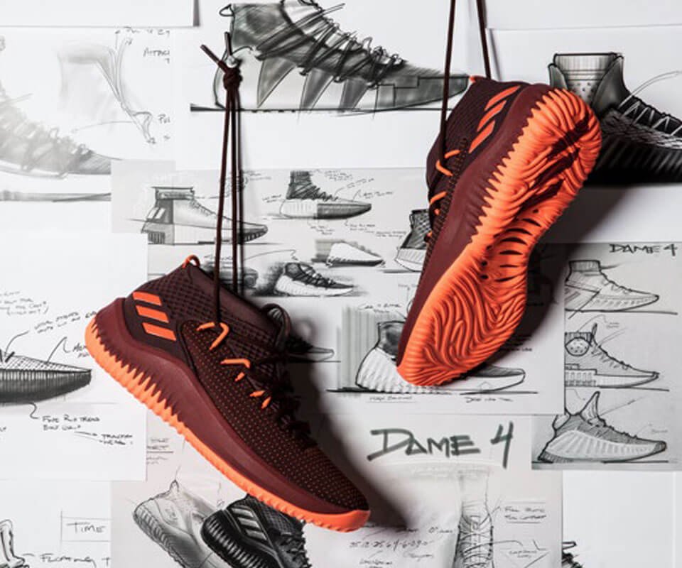
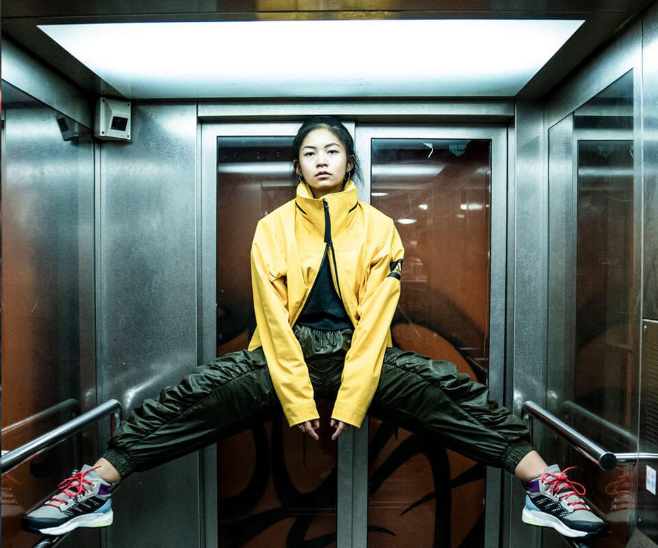
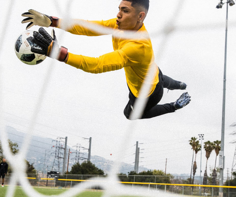
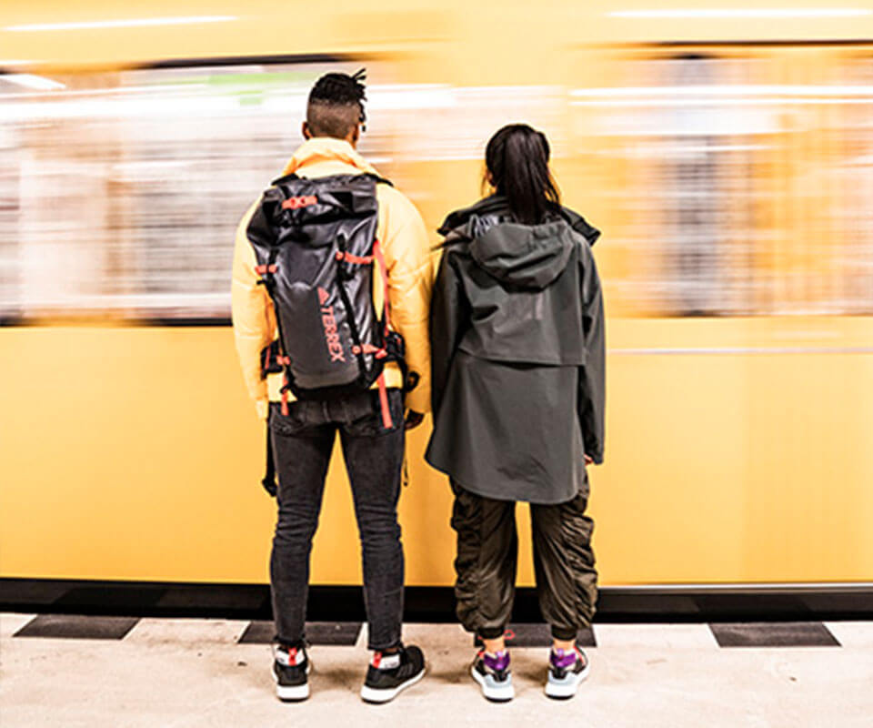
Here you can find some of the components used in the design system of the app: neutral colour schemes, typographic and photography guidelines as well as a modular responsive design system.
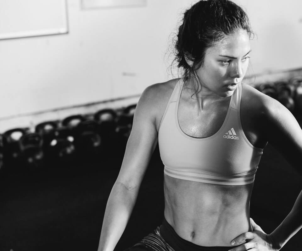
The visual elements of adidas app are simple, clear and approachable. They support structural simplicity for a user-friendly experience and light-weight navigation.
I worked in the adidas app for 2 years as a part of a team of 7 freelancers and in collaboration with two teams of adidas employees. My role was Ui designer


